Leading Therabody's expansion into the Turkish market, I led the effort to localize the brand's social media presence. The goal was to build a culturally attuned visual identity that resonated with local audiences while maintaining strict alignment with Therabody's global image.
Leading Therabody's expansion into the Turkish market, I led the effort to localize the brand's social media presence. The goal was to build a culturally attuned visual identity that resonated with local audiences while maintaining strict alignment with Therabody's global image.
Project Snapshot
Visual Strategy
Establishing a modern, corporate, yet approachable design language.
Brand Localization
Adapting global assets for the Turkish demographic.
Art Direction
Overseeing the visual consistency across digital and print media.
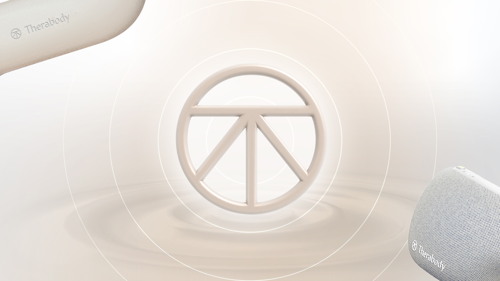
Design Concept: The Ripple Effect
Theragun’s percussive therapy sends waves through muscle tissue and the visual language mirrors that. Waveform shapes and flowing gradients run through every layout, translating the device’s physical impact into a design system that moves the same way the product does.


Inspiration and use of wave design

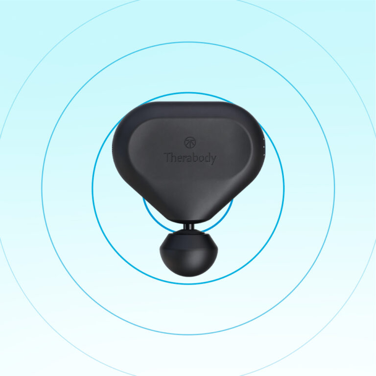
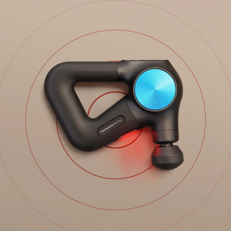
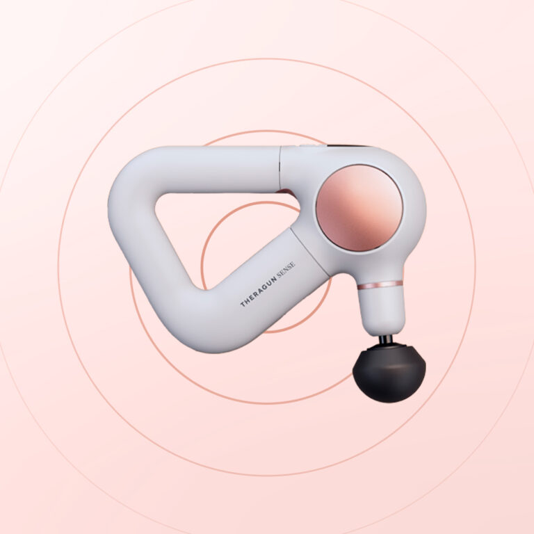
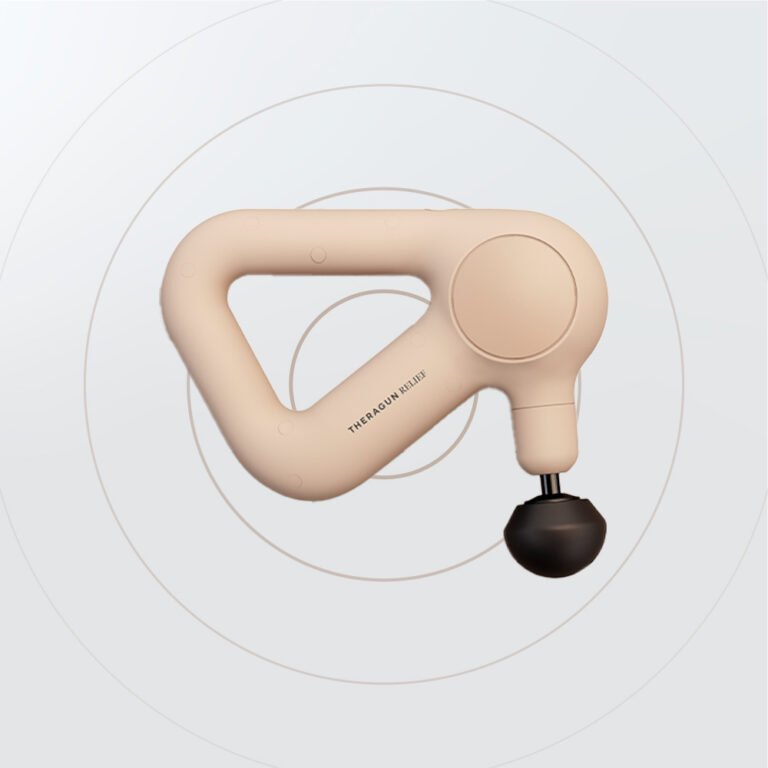
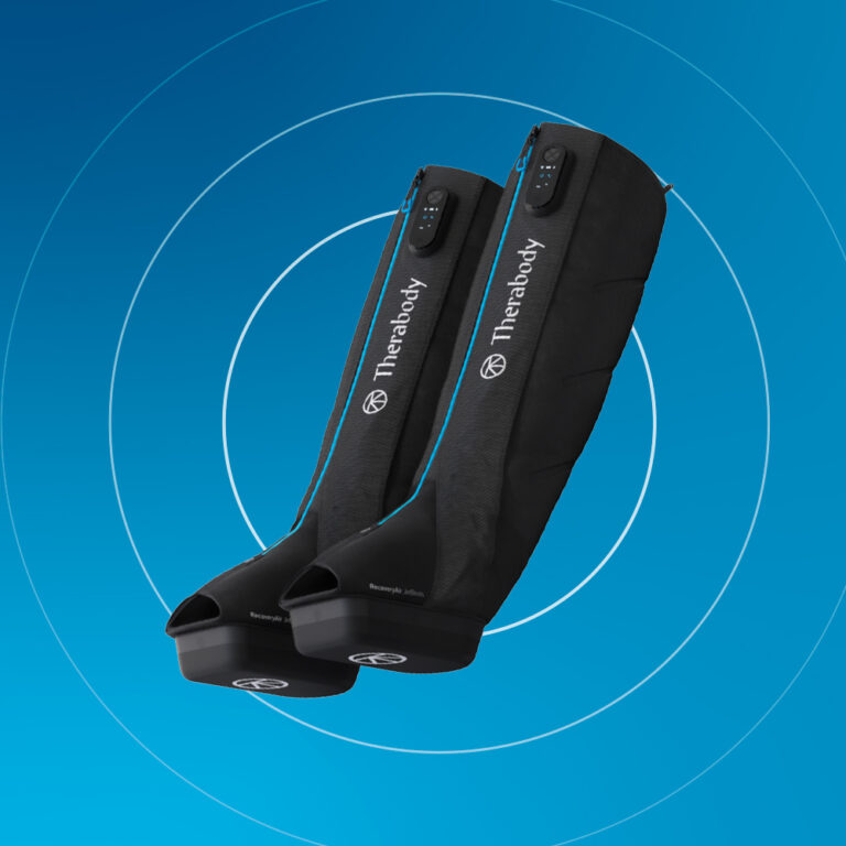
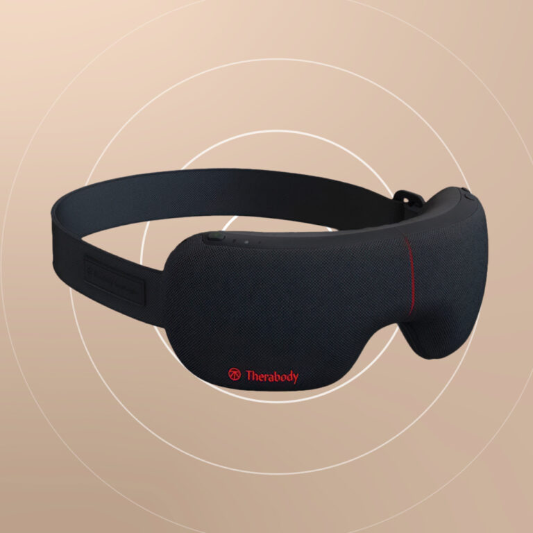
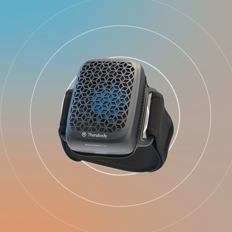
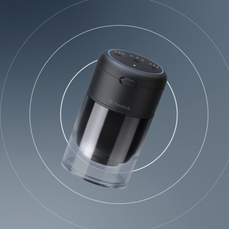
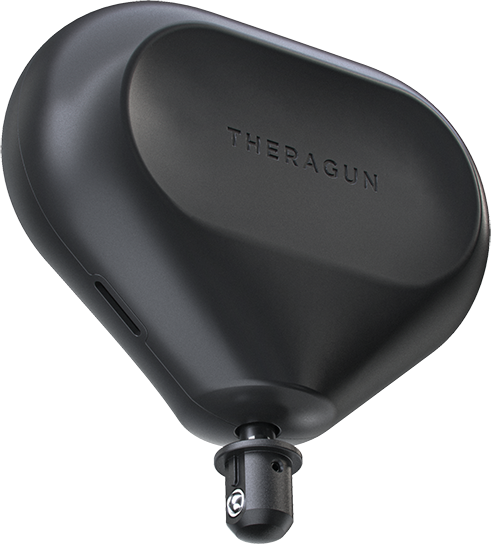
Gradients and wave design appearance on a per-product basis
Execution & Typography
In order to create a work consistent with the brand’s global corporate identity, I set Therabody’s global corporate identity as a guide for myself and used the color palette and corporate font in the localization. For localized flair, I leaned on subtle gradient highlights in headlines to emphasize flow and dynamism. This system has been scaled efficiently from digital to print for a unified brand experience.

A 6-post series describing the brand designed for the Instagram page.


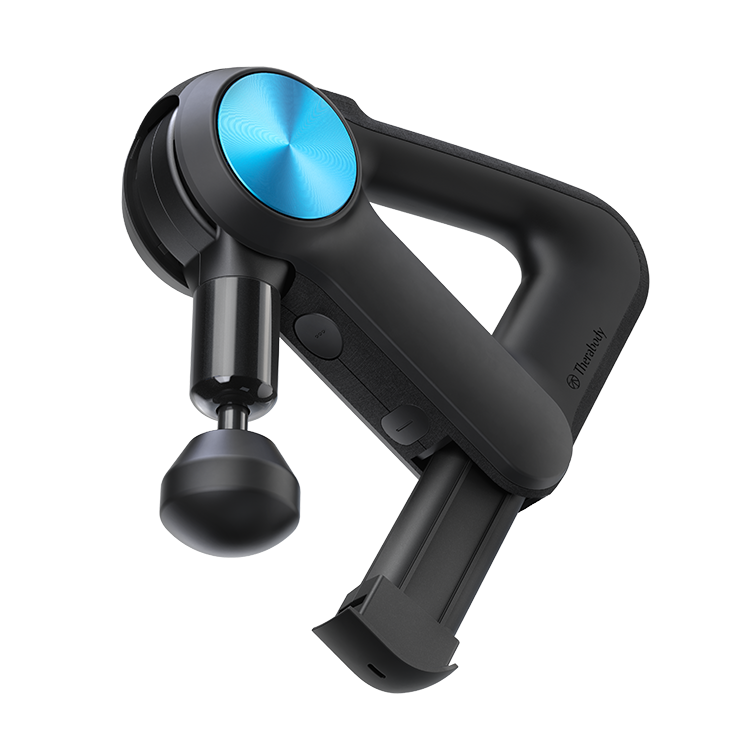
Product bases visual design samples

Magazine advertisement

Outdoor Advertising Work