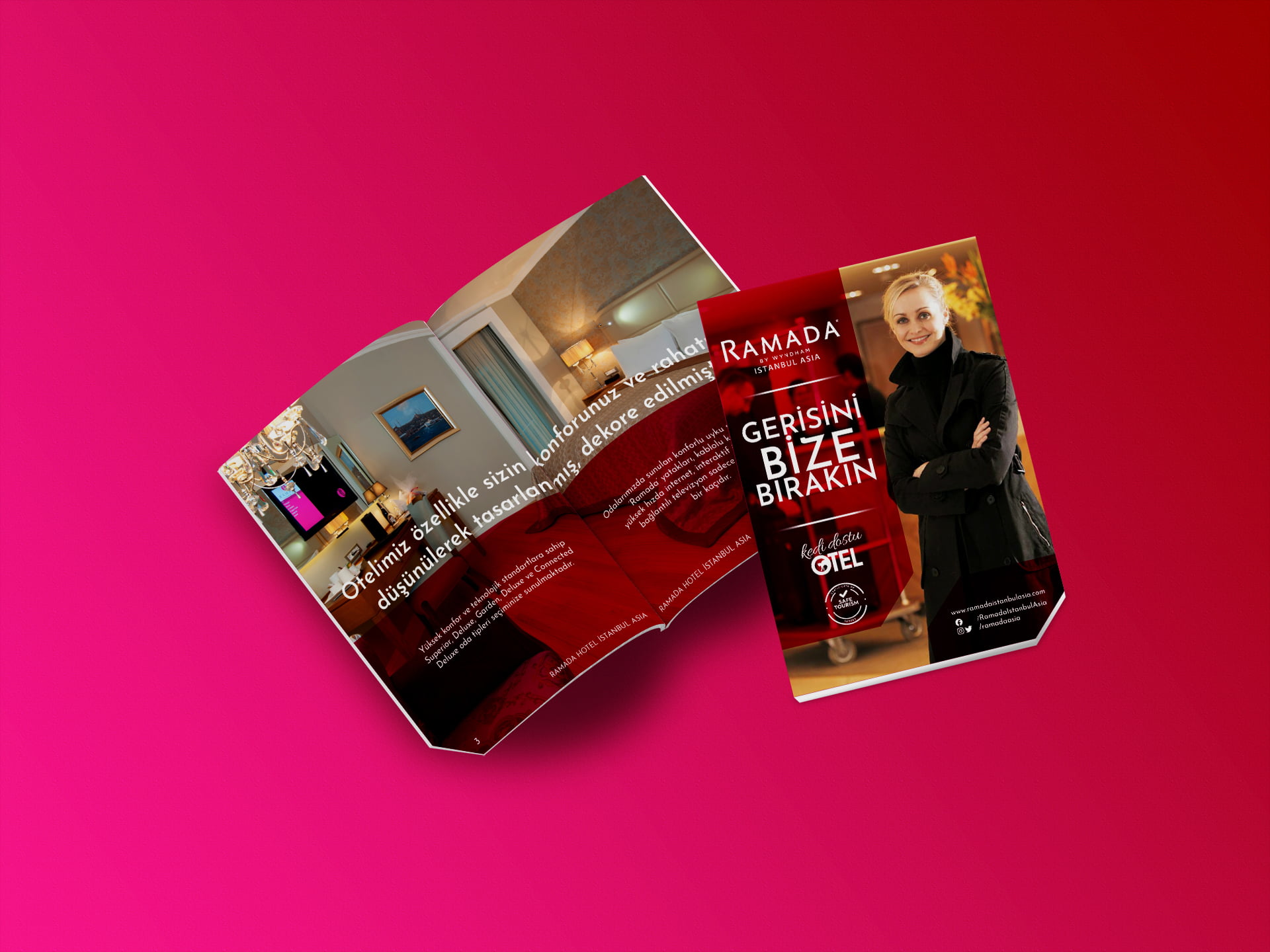
Ramada by Wyndham Istanbul Asia needed a revised corporate brochure to cater to its local and international clientele. This had to be designed as a compact, folding, bilingual marketing tool (Turkish & English) that was not only within the global brand guidelines of Ramada but also fit in with the active social media visuals of the hotel.
Ramada by Wyndham Istanbul Asia needed a revised corporate brochure to cater to its local and international clientele. This had to be designed as a compact, folding, bilingual marketing tool (Turkish & English) that was not only within the global brand guidelines of Ramada but also fit in with the active social media visuals of the hotel.
Project Snapshot
Editorial Design
Layout, composition and typography for a bi-fold format.
Brand Alignment
Ensuring seamless visual continuity between digital assets and physical print collateral.
Print Production
The pre-press preparation and technical oversight of the final output.
Design Concept: Visual Strategy
In order to meet the “social media parallelism” requirement, I applied the sharp, geometric rectangular outlines that they used in their digital posts. This provided a cohesive visual link for customers going from the hotel’s Instagram/LinkedIn pages to the physical lobby experience.


Dimension of Brochure

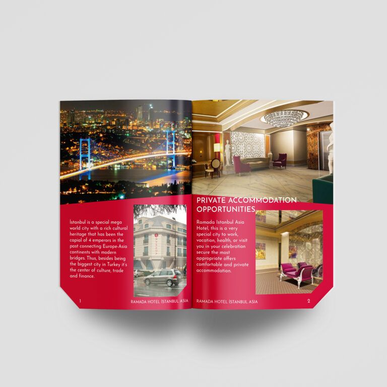
English and Turkish versions of the brochure designed for Ramada Istanbul Asia
Color & Typography
The design centers around the signature Ramada Red to maintain strict corporate identity. I chose Josefin Sans for typography, a geometric typeface that not only pairs well with sharp layout structures but also offers great readability in the compact A5 format.

Ramada Istanbul Asia brochure print PDF
Ramada Istanbul Asia alternative brochure design